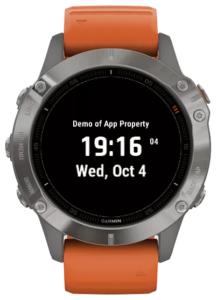
We’re thrilled to announce the release of version 8.5.0 on watchfacebuilder.com! 🚀 Here’s what’s new and improved:
- Introducing WFB API Key: We’re rolling out something special for our premium account users – the WFB API key! With this key, you’ll gain access to a premium services (more detail to come).
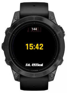
- Garmin SDK Data Fields: Added the missing Garmin SDK data fields recently released.
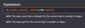
- Complication Value Retrieval: Now, you can fetch values directly from complications, ensuring your data is updated more frequently than retrieving it from sensor history table on your device.
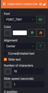
- Bug Fixes: eg. resizing un-resizable objects and more.
- App Authentication: For our premium account users, you can add “app auth” data field on your design. Anyone can try your watch faces, and after the trial period, a message will show on the watch. Then users can contact you, and you can review their request on the back end of WFB site to approve or deny their access.